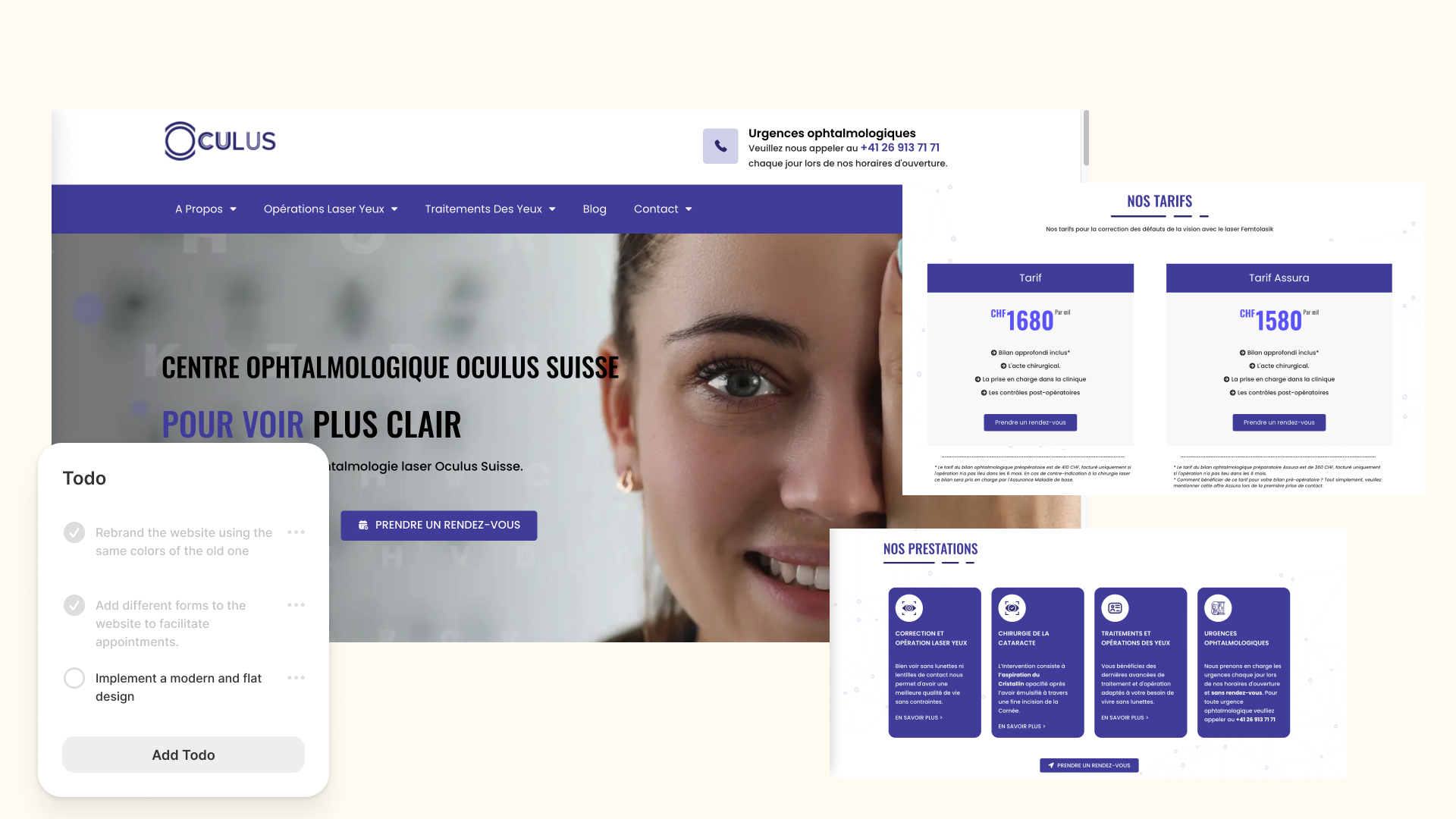
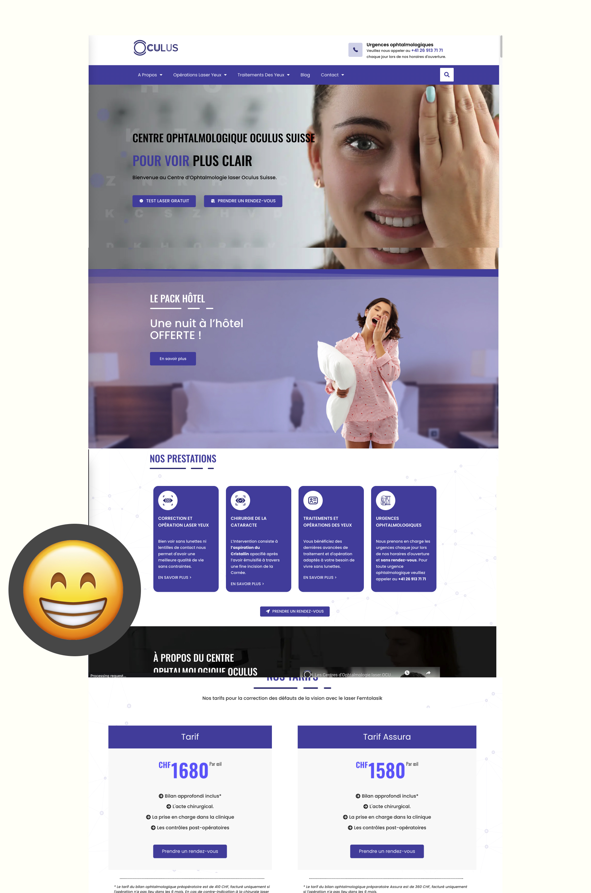
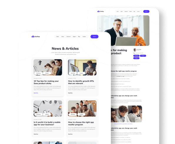
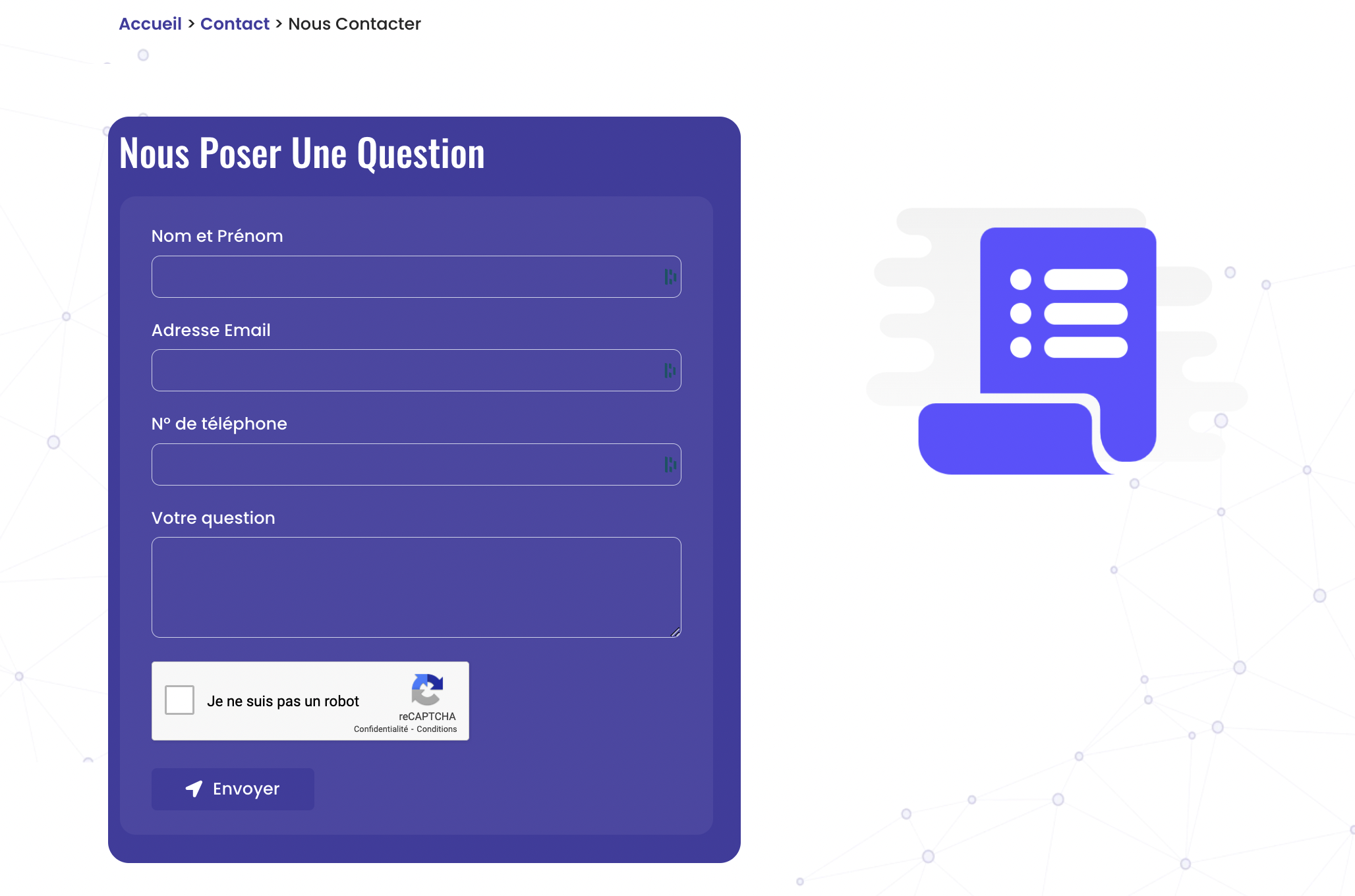
I recently completed a project for an ophthalmologist named Oculus, where I rebranded and developed a new website on WordPress. My main goal was to give the website a modern look while also making it more user-friendly by integrating contact forms that make it easy for people to reach out to the ophthalmologist. The end result is a revamped website that is more visually appealing, easier to navigate, and offers a more seamless user experience for potential patients looking to contact Oculus.
Web developper
July - August 2022 (1 month)
WordPress, Elementor, ACF Pro


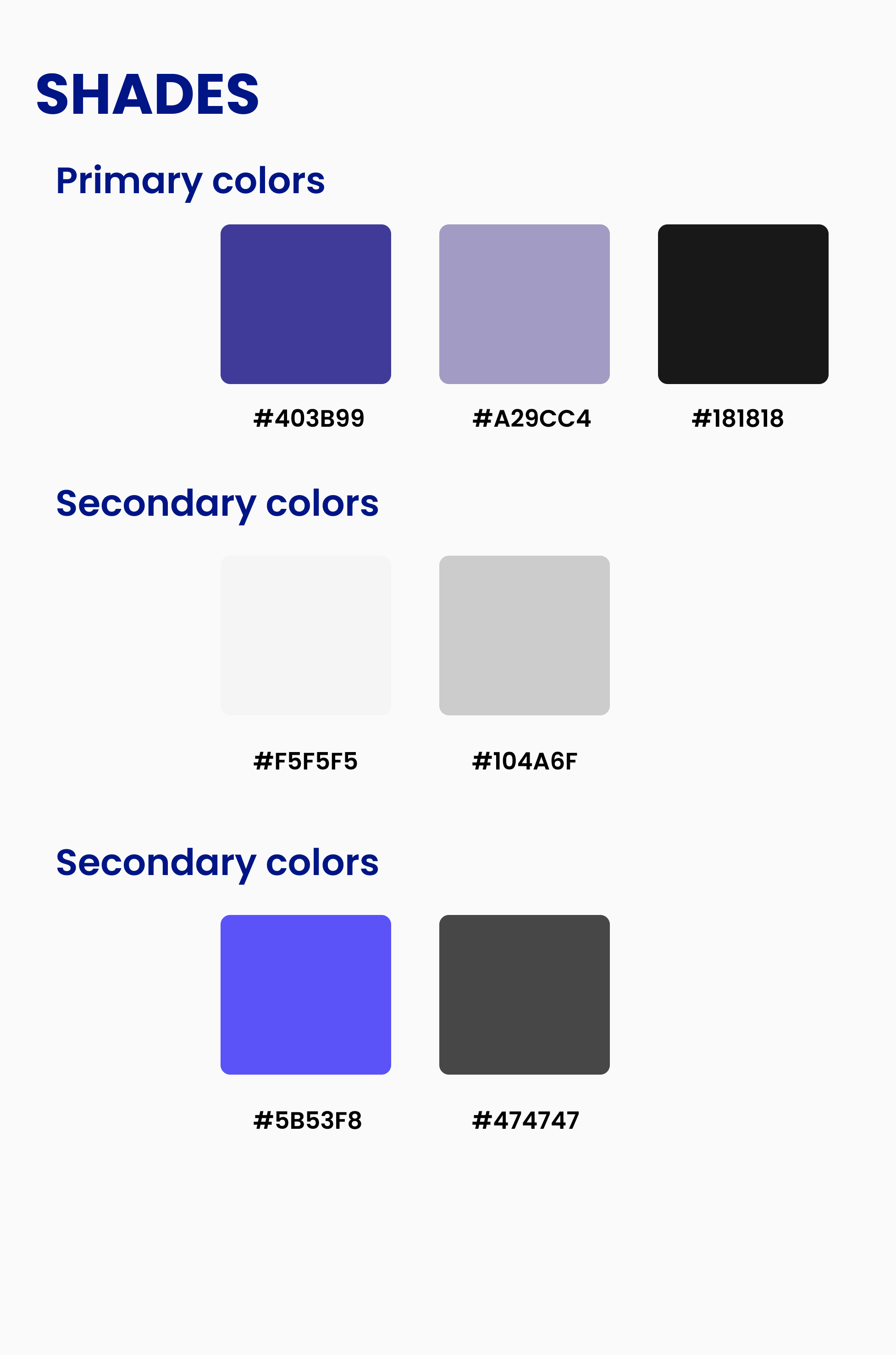
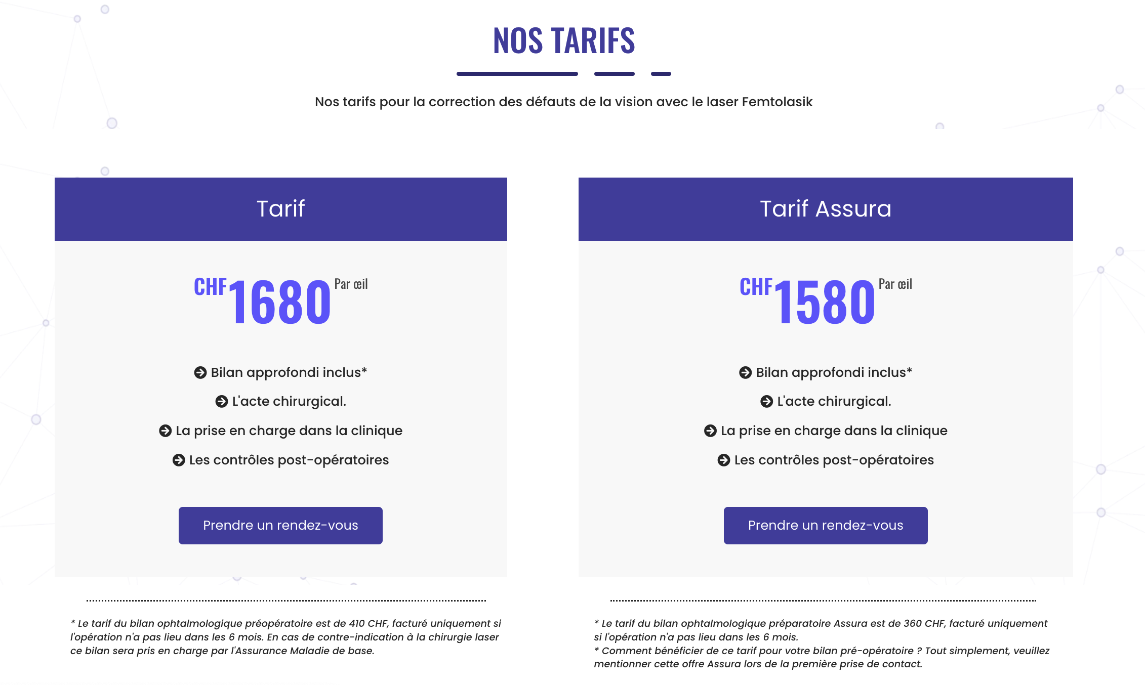
The goal of creating the new Oculus Ophthalmologist website was to refresh the brand's image while maintaining its existing identity. This involved implementing a modern and fresh design that would appeal to users, while also staying true to the company's traditional look and feel.In addition to updating the visual design of the website, the client also wanted to make it easier for customers to schedule appointments.
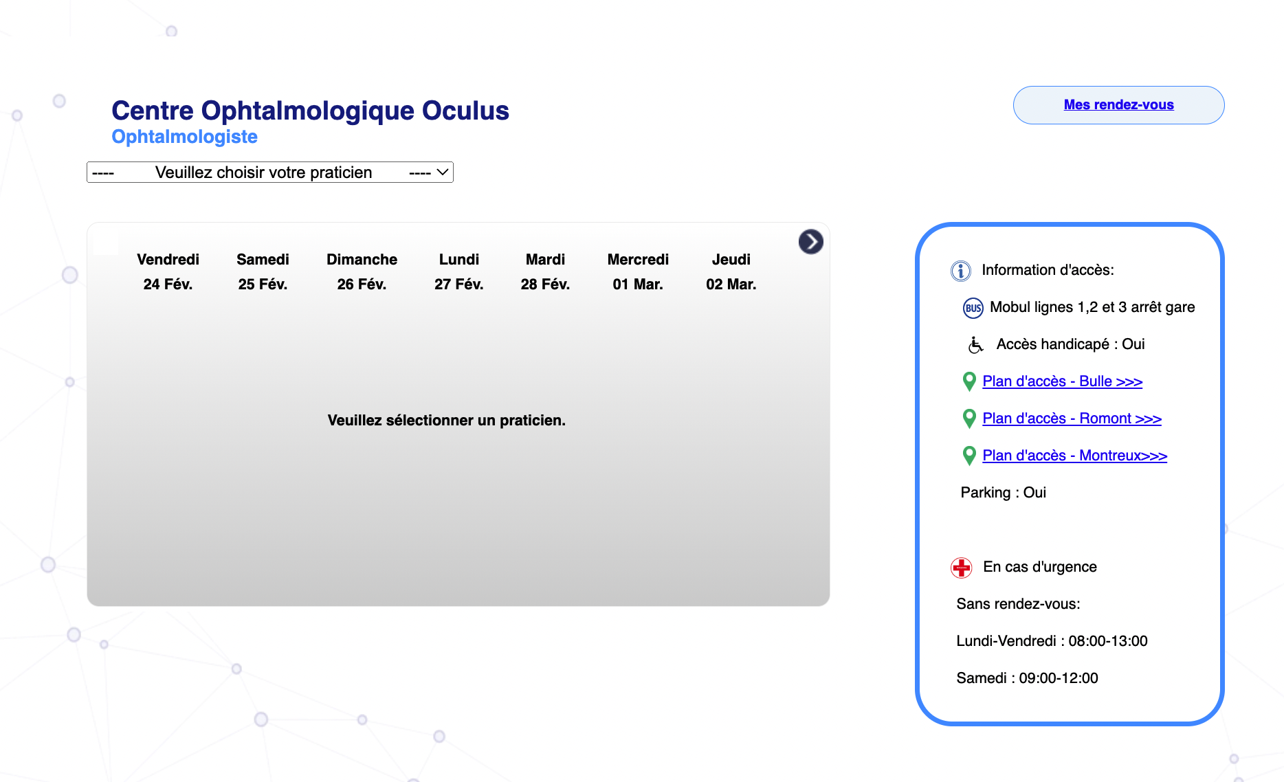
This involved designing and integrating a digital form and calendar system that would allow users to book appointments directly on the website, reducing the need for phone calls and improving the overall user experience.By accomplishing these goals, the new Oculus website provided a more convenient and streamlined experience for customers, while also helping the company to maintain its established brand identity.
Limitations bring out the best in a situation, which is why we keep Small Studio a nimble little setup. Team members are - by necessity - highly experienced, skilled, confident and innovative.


Powered by VictorFlow
Creating digital tools for doctors can be a great way to improve the efficiency and convenience of healthcare services. However, designing digital tools for an ophthalmologist website can be particularly tricky because it is a field where people may require personal advice and guidance.
Eye health is a crucial aspect of overall health, and patients often rely on the expertise of ophthalmologists to help them navigate complex medical issues. When designing digital tools for an ophthalmologist website, it is essential to strike a balance between providing convenient and accessible services for patients while also ensuring they have access to the personal advice and guidance they need.
Designing digital tools for ophthalmologist websites requires careful consideration of the patient's needs and expectations.
It is essential to balance convenience and accessibility with the need for personalized advice and guidance
One way to achieve this balance is to provide a range of digital tools that can help patients manage their eye health more effectively, while still offering access to personalized advice from doctors when necessary. For example, a digital tool that allows patients to schedule appointments online can improve convenience, but it should also include a way for patients to communicate with their doctor and ask questions about their health.
